Simplifying a Data-Heavy Account Profile
FieldHub is an ERP-style accounting and field service management platform for managing customer accounts, work orders, invoices, payments, and field operations.
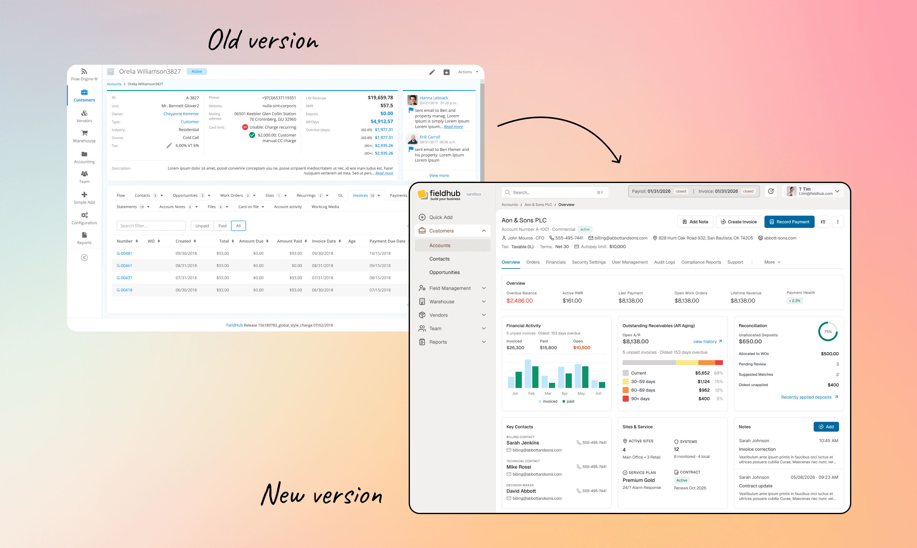
This case study covers the redesign of the core Company/Account Profile: one of the most frequently visited parts of the product.
The redesign hypothesis was based on behavioral analytics.
Company:
Field Hub

Problem
Research & Analytics
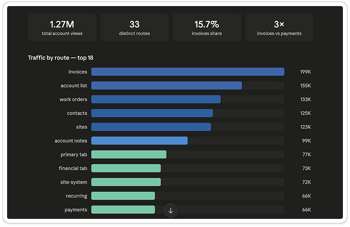

With the development team, I collected behavioral data from the Account Profile. I used it to understand how people navigated the page and compared their behavior with the existing interface.
I grouped the main user flows by usage and priority, then used that structure to rebuild the information architecture and created a clear hierarchy by placing high-priority information in dashboard tiles and keeping lower-priority information in the tabs.
Key findings from the data:
01
Invoices were the most visited section.
Users were clearly checking billing status constantly, more than they were recording payments, suggesting either friction in the payment flow or that payments were happening outside the app.
02
Users often returned to the Account List
Users kept bouncing back to it repeatedly rather than jumping directly to records, indicating a lack of quick-access shortcuts, recent history, or global search.
03
Work Orders, Contacts and Sites were core workflows
These three pages all had similar traffic. Together they represented how people actually worked inside the system.
Despite that, they were hidden behind the same tab strip as many rarely used pages.
04
The overview wasn't answering enough questions
Users frequently opened both Primary and Financial tabs even though some of that information already existed on the Account page. That told me the summary wasn't useful enough.
People still had to open additional tabs just to check balances, deposits or revenue.
My task
My task was to reorganize the interface and propose a clearer page structure, information hierarchy, and interaction model. I also explored a more modern visual direction for the app.
Process
I used the behavioral data to define the first design hypotheses. I then used AI to create early prototypes and explore different page structures, layouts, and interactions. These concepts helped me test ideas quickly, but they still needed a designer’s review.


I gathered feedback and redesigned the interface myself in three stages.
In the first version, I kept the existing structure and adjusted the hierarchy based on the analytics. I also introduced a new visual style without changing the interface too much.


In the second version, I made more significant changes.
I replaced the old structure with a dashboard layout, added tiles, and brought the most important information into the main view.

In the third version, I found a middle ground. I reduced the number of charts and kept the experience closer to what users already knew, while still applying the new structure and visual style.

Outcome
The final design gives users a clearer view of the account without requiring them to open several separate tabs.
Financial status, outstanding receivables, deposits, key contacts, active services, and recent notes are now available from the main screen.
The new hierarchy also gives the most frequently used workflows more visibility and moves low-traffic functionality out of the way without removing it.